A Guide to MLPerf’s Benchmark Scores
Article By : Sally Ward-Foxton

What to look for and where to start.
If you follow the AI accelerator industry, you may have seen that MLPerf released a set of benchmark scores for their inference benchmarks yesterday. These scores are reported as a multi-page spreadsheet with figures ranging over five orders of magnitude. Most systems have scores in only some boxes, and systems which seem similar may have wildly different scores. To make things worse, higher or lower numbers can be better, depending on which category you’re looking at.
Habana Labs research scientist Itay Hubara was kind enough to explain the meaning of the different categories, divisions, models and scenarios in the MLPerf spreadsheet for me. Here’s what I learned.
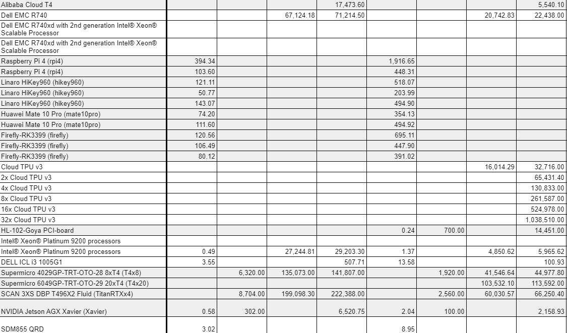
The MLPerf scores spreadsheet is not straightforward to understand (Image: MLPerf)
Categories
Available means the system is currently on the market and available to purchase. The software stack has to be fully ready and submitters have to give the community the ability to reproduce their results. This means any code which isn’t in the company’s SDK has to go on to MLPerf’s Github.
Preview means the submitter will have this system available in the next round of MLPerf inference scores (expected early next summer). Submitters to this category are not required to hand over all their software.
Research, Development, Other means the system is still a prototype or is not intended for production, and submitters are not required to share any software.
Divisions
The Closed Division is intended to allow direct, apples-to-apples comparison between systems, and the criteria companies have to stick to are strict, including a standard set of pre-trained model weights that have to be used.
In the Open Division, which Hubara describes as the “wild west,” submitters don’t need to follow most of the rules. However, they have to disclose what they have changed. This might be something like retraining the model, or fine tuning it.
Companies use this division to show off by letting their algorithm engineers loose. For example, Habana Labs showed open division scores which reduce the latency to a quarter of the latency for the closed division scores, to show off the capabilities of its Goya chip.
The nature of this division means it’s unwise to try to compare closed scores to open scores, or even open scores to open scores.
Recommended
Who’s Winning the AI Inference Race?
Models
MobileNet-v1 and ResNet-50 v1.5 are for image classification with the ImageNet dataset used for inference. MobileNet is a lightweight network intended for mobile phones, while ResNet-50 is more heavyweight by comparison and is used by bigger accelerators.
SSD with MobileNet-v1 and SSD with ResNet-34 are for object detection. SSD refers to single shot detector, an algorithm for detecting individual objects for classification in a picture, but it has to work in partnership with a classification algorithm such as MobileNet or ResNet.
The MobileNet version is again a lighter weight model run on lower resolution pictures (300 x 300 or 0.09 Mpix). The ResNet-34 version inferences higher resolution images (1200 x 1200 or 1.44 Mpix).
These models use the Common Objects in Context (COCO) dataset for inference.
GNMT is the only benchmark that isn’t based on convolution or image processing. It’s a recurrent neural network for language translation (in this case, German to English).
Scenarios
There are four different scenarios, two for inference at the edge, and two for inference in the datacentre.
Single Stream simply measures the time taken to inference one image (batch size of 1), measured in milliseconds. In this category, a lower score is better. This scenario might correspond to a mobile phone that is performing inference on one image at a time.
Multi-Stream is the measurement of how many streams of images can be handled at once (batch size >1), with a latency between 50 to 100 milliseconds, depending on the model. Higher number in this category is better. Systems that do well here might end up in autonomous vehicles which use multiple cameras pointing in different directions, or in surveillance camera systems.
In the Server scenario, multiple users send queries to the system at random times. The metric is how many queries the system can support within a certain latency, when the streams are not constant like for the multi-stream scenario. It’s harder because batch size must be dynamic. Higher number is better.
The Offline scenario might be batch processing of images in a photo album where the data can be processed in any order. It’s not latency constrained. Instead, this scenario measures throughput of images measured in images per second. Higher number is better.
Number of accelerators
The benchmarks compare systems, not chips. Some systems might have one host chip and one accelerator chip, while the largest had 128 Google TPU accelerator chips. The scores are not normalised per accelerator, since the host also plays a part, but they are roughly linear with the number of accelerators.
Why are some scores blank?
There is no requirement to submit results to every scenario or every model, or even groups of models. Devices intended for edge platforms might choose to submit only for the single-stream and multi-stream scenarios, while data centre platforms might choose to submit only for the server and offline scenarios. Clearly, each company has chosen to submit scores which it thinks will show its system in the best light.
There are also other factors at play. For example, Hubara also explained that one of Habana’s scores is blank because the company missed the submission deadline for this round.
Also, there were fewer submissions for the GNMT translation model, which is now widely seen as out of date, with many companies preferring to spend time implementing a newer algorithm such as BERT.
Caveat emptor
Overall, the scores measure pure performance, but selecting one system for a practical application of course requires consideration of many other factors.
For example, there’s no power measurement in this set of scores (this is rumoured to be coming in the next version of the benchmark).
Cost is also not indicated. Obviously if one system has one accelerator chip and one has 128, there will be a price difference. The spreadsheet also lists the host CPU used for each system, which can add significant cost. Some may also require expensive water cooling.
The Form Factor categories (mobile/handheld, desktop/workstation, server, edge/embedded) are indications given by the system manufacturer. They are not strictly part of the benchmark as there are no criteria for each category.
Clicking on the details link on the right hand side of the spreadsheet for every system should take you to some further details about the system’s hardware and software which are worth looking at. Some of these fields are mandatory, some are not, but this may shed light on system requirements such as cooling.

Subscribe to Newsletter
Test Qr code text s ss